Tuesday, August 24, 2010
Mini Size, Maxi Features: The HTC HD Mini Reviewed
Posted by Doug Raeburn in "HTC Windows Phones" @ 07:00 AM
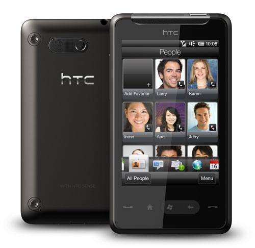
Product Category: Windows Mobile 6.5.3 Smartphone
Manufacturer: HTC
Where to buy: Expansys
Price: $339 USD Unlocked version
Specifications: From HTC site
Pros:
- Good performance;
- Small and light - fits nicely in your hand and your pocket;
- Capacitive touchscreen is responsive with fluid scrolling;
- Most thoroughly "touch enabled" WM phone yet.
Cons:
- Capacitive buttons on front panel too easy to hit by accident;
- Back cover difficult to remove;
- Doesn't support 3G for AT&T.
Summary: Not too long ago, HTC introduced the HD2, which featured just about everything a Windows Mobile smartphone buyer could ask for. But it also had a couple of characteristics, namely comparatively large size and heavy weight, that didn't thrill some prospective buyers as much. So HTC subsequently introduced the HTC HD Mini in Europe, with the goal provide the bulk of the HD2's capabilities in a smaller and lighter form factor. How successful were they at achieving that goal? Join me as I research that question...
It's interesting to see that some of the most intriguing and sophisticated designs for Windows Phone 6.5.x are coming out just as that version of the OS is about to be superseded. HTC has been very busy coming up with a vast array of designs for the Android OS, while the release of new Windows Phone designs from them has slowed considerably. I'm hoping that they start giving strong support to Windows Phone 7 when it finally becomes available, because the HD Mini is on a par hardware-wise with their Android offerings and that combined with a new, more modern OS might just give the current smartphone sales leaders some real competition.
First Impressions
Upon handling the Mini for the first time, I was pleasantly surprised. I found a device that felt sturdy, lightweight and a perfect fit for my somewhat small hands. I was also pleased to see few of the "form over function" design cues that were evident with my Touch Diamond. As much as I loved that phone, whoever thought that a faceted back was a good idea, well, I hope they've found a different line of work better suited to their questionable judgment.
The HD Mini is a device designed for those who liked everything about the HTC HD2 except its size and weight. Of course, since it's clearly a sibling of the Android-based HTC Aria offered by AT&T, it's unknown if the hardware was truly designed specifically to supplement the HD2 or if it's just a Windows Phone version of a phone intended for multiple platforms. The Mini's dimensions (4.09" x 2.27" x 0.46" or 103.8mm x 57.7mm x 11.7mm) give it a footprint that's a whopping 3.24 sq in or 26% smaller than its big brother. At 3.88 oz. (110 g) with battery, it's also 1.7 oz. (47 g) or 30% lighter than the HD2. I prefer smaller, more pocketable phones, so the Mini's smaller and lighter stature immediately appealed to me.
Of course, since there's no such thing as a free lunch, the Mini has a few scaled back features and specs to go along with its smaller size. First, it should come as no surprise that the screen is smaller, an unavoidable change given a 26% smaller footprint. The HD2 has a huge 4.3" screen, while the Mini makes do with a considerably smaller 3.2" screen. And size isn't the only scaled down aspect of the Mini's screen...it sports a resolution of 480 x 320 vs. the HD2's 800 x 480, giving the Mini a mere 40% of the pixels of the HD2. Other scaled back features include a slower processor, less RAM and no flash for the camera (though they both are rated as 5 megapixel). The Mini does offer ~20% greater battery life, however... there are some benefits to a slower processor and a smaller, lower resolution screen.
In this day and age of 800 x 480 HD2's and 960 x 640 iPhone 4's, the Mini's 480 x 320 screen may sound underwhelming. But any doubts that I had about screen quality went away when I pressed the Mini's power button. As is typical for HTC devices, the screen is beautiful. Extremely bright, crisp and colorful. If I had been forced to guess the resolution of the screen based on appearance, I probably would have said 640 x 480 like my Touch Diamond. So it may not have the highest resolution screen on the market right now, but I doubt that many people would complain after using it.
Hardware Tour
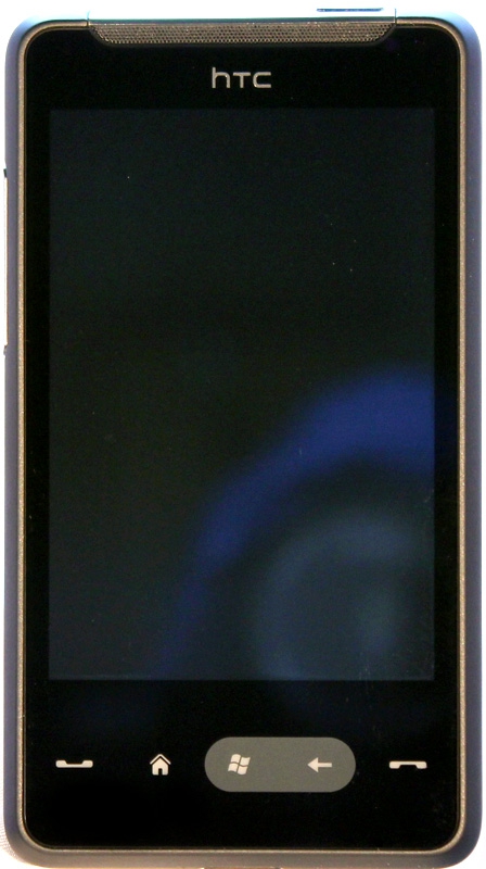
Figure 1: The prevailing standard for WM 6.5.x designs. The capacitive buttons were a bit too easy to activate by accident.
The layout of the front panel provides all of the expected features and controls. Along the top you have the multi-function notification light on the left and the earpiece in the middle. Below the screen you'll find a row of buttons that adhere to the latest and greatest standards for Windows Phones. From left to right you'll find the Talk/Send button, the Home button, the Start button, the Back button and the End button.
For longtime users of Windows Mobile phones, a few things might stand out. First, there is no longer a directional pad, it having been rendered largely redundant by the very sensitive capacitive screen. Second, you'll note that the screen no longer features the Start button that was once ubiquitous on Windows Mobile Professional phones (the most recent previous name for the platform). The dedicated Start button under the screen replaces it. And when you press that button, you're presented with a screen of diagonally arranged icons (similar to that of Windows Phone Standard devices and the main screen of an iPhone) rather than the desktop style fly-out menu of older versions of Windows Mobile.
The buttons are flat and touch sensitive, so you won't be able to operate them by feel. Thankfully, the buttons are always visible, even when their backlighting is off. When the light sensor detects low light conditions, it automatically activates the backlighting. That's an improvement over my Touch Diamond, on which the similar touch activated buttons were invisible when the backlight was off. What's not an improvement, though, is their location and perhaps excessive sensitivity. I was forever pulling up the phone interface by touching the Call/send button by accident, which of course disrupted whatever I was doing. Never had that problem with the TD, even though its front panel buttons were capacitive as well.

Figure 2: The top view. The metallic accent is a nice touch.
The top panel features the power button and a 3.5 mm audio jack. It's looking like HTC has finally abandoned proprietary connectors for good (yay)!

Figure 3: Nothing more than the volume control...
The left side panel features only a single control for volume up and down.

Figure 4: I wonder if Apple will ever discover the benefits of non-proprietary connectors. Probably the only thing they don't benefit is Apple's bottom line for accessory sales.
On the bottom panel, you'll find the microphone and the Sync/Charge connector. Once again, the connector is non-proprietary (Micro USB).
The right side panel is free of any controls, so I didn't take a photo. Imagine the left side without the volume control and you've basically got it.
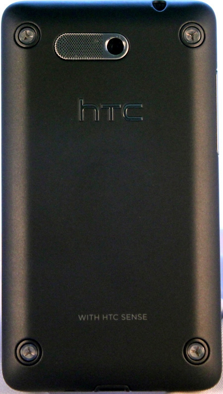
Figure 5: As usual, HTC tries to inject some style into their phones.
The back cover is black with a matte finish. The phone's speaker and camera lens appear here. There's some nice detailing here, with a combined metal cover for the speaker and surround for the camera lens. Attractively finished screw heads are situated in all 4 corners. These are real screws that hold the phone together, but they appear through holes in the back cover... you don't have to remove them to remove the cover.
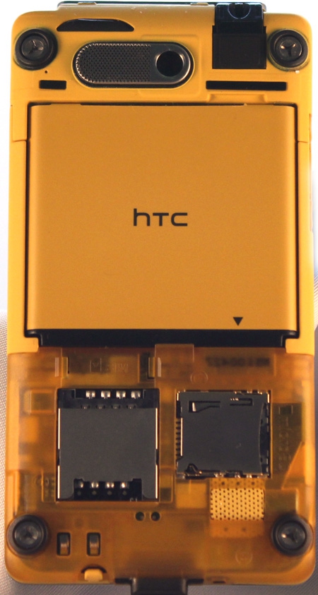
Figure 6: Quite the contrast between the exterior and interior colors...
Removing the cover highlights one of the few ergonomic hiccups on the Mini. There's a small indent at the top of the screen into which you insert something (probably a fingernail) to pry the cover off. It takes some work to get the cover to pop off, and I imagine you could easily break a nail and/or ruin a manicure in the process. With all of the nice design touches in evidence in other aspects of the Mini, the rather poor design of the rear cover was disappointing.
Follow-up note: as I was using the Mini, I discovered that the rear cover became easier to use, loosening up a bit. Which brings up a concern about it continuing to do so, becoming too loose. Not a great cover design in any case, IMO.
The last point aside, though, I was impressed with the overall design of the Mini, with high quality materials, tight construction and thoughtful features.

