Thursday, February 18, 2010
Windows phone 7 UI vs. iPhone UI: FIGHT!
Posted by Jason Dunn in "Windows Phone Articles & Resources" @ 03:00 AM
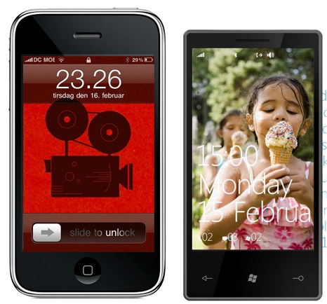
"The lock screen is up first, and a first example of the elimination of what Tufte would call interface debris. No controls here. To get unlock a Windows phone, simply slide the screensaver upwards with your thumb. The phone is in there, sitting behind the screensaver image. I remember when I first saw the iPhone and thought "oh, finally, no more remembering obscure keyboard patterns to open a phone". Seeing the Windows unlock mechanism, well, caused a similar response."

This is a really well-balanced and thoughtful look at the interface on the iPhone vs. the interface on Windows phone 7. Well worth the read - the person writing it is someone who thinks deeply about user interface and his impressions of Windows phone 7 are interesting to read.


