Wednesday, September 23, 2009
Dressed to the Nines - the ACER F900 Windows Mobile Phone
Posted by Doug Raeburn in "Pocket PC Hardware" @ 07:00 AM
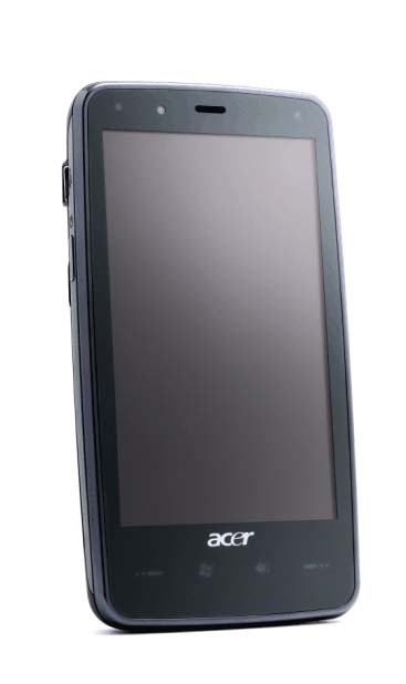
Product Category: PDA Phone
Manufacturer: Acer
Where to Buy: Expansys [Affiliate]
Price: $479.99 USD
Specifications: From the Expansys site
Pros:
- Elegant design;
- Large, sharp and vibrant screen;
- Very good speakerphone.
Cons:
- 128 MB of RAM isn't sufficient for such an advanced device;
- Screen isn't as touch sensitive as many competitors;
- Acer Shell touch interface lacks the pizazz and depth of HTC's TouchFlo.
Summary: Will we ever be able to write another touchscreen phone review without mentioning the iPhone? Its phenomenal success and near-iconic status have sent the manufacturers of phones using the more "venerable" operating systems, such as Windows Mobile and Blackberry, scrambling to come up with iPhone alternatives. I haven't seen much from Acer in phones in the past, but its F900 has impressive specs and looks to have the potential to challenge the iPhone as well as other WinMo contenders such as the HTC Touch Diamond 2. Does the F900 have what it takes to bring iPhone shoppers into the WinMo fold?
Introduction
I've been impressed with Acer products that I've used in the past and found their quality of materials and construction to be quite competitive. I got the same impression from the F900 when I first saw it and held it in my hands. It has a solid feel that's comparable to my original Touch Diamond, though the Touch Pro 2 that I just reviewed feels a notch or two above both other phones. The solid black front with no visible buttons or directional pad mimics that of the iPhone, so the competitor that Acer is targeting seems pretty apparent. Let's take a closer look at the hardware.
The Hardware Tour
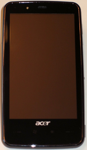
Figure 1: Can't get much simpler than this... not to mention elegant. Too bad the buttons are virtually invisible unless lit.
As described above, the F900 sports a minimalistic looking solid black front. Although there are no visible keys, there are 4 touch sensitive keys below the screen that glow with a blue backlight when you touch them. The only problem is that you can't see them when the backlighting is off and they react immediately when you touch them, so you have to rely on your memory as to which button is where. They are, from left to right: Talk/Send, Start, OK/Close and End. The existence of the Start button suggests that this phone may either be eligible for a WinMo 6.5 upgrade (I've yet to hear any rumors about this) or may be the basis for a subsequent WinMo 6.5 phone, since the Start button is one of the requirements for 6.5 designs. Unfortunately, the Start button isn't as slickly implemented as the latest HTC competitors (Touch Diamond2 and Touch Pro2). While pressing the Start button on the F900 causes the standard Start menu to drop down, the HTC phones reveal a set of finger friendly icons instead.
The buttons may be present but often invisible, but a directional pad is nowhere to be found. This matches the HTC competitors and serves as an indicator as to how successful the manufacturers think the touch screen capabilities have been implemented. More on this later.
Across the top on the left, the F900 has an indicator for GPS/WLAN/Bluetooth, flashing different colors for each. Moving to the right, we see a light sensor, the earphone speaker and the charge indicator. And last but far from least, we have the huge 3.8" WVGA (800 x 480) touchscreen with 65K colors. This screen dwarfs that of the original Touch Diamond (2.8" VGA) and even tops the TD2's 3.2" WVGA.
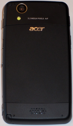
Figure 2: It's nice to see an LED flash to go with the camera... every little bit helps.
The back of the F900 features the lens for the 3.2 MP auto-focus camera. Just below the lens is the LED flash, a unique feature among the phones to which I've been comparing the Acer. At the bottom is the external speaker, used for the speakerphone.

Figure 3: Nothing much on the top. The manual doesn't say what the open slots are for.
The top really has nothing of note. I'm guessing based on the word GPS seen there, the GPS receiver is underneath. The owner's manual makes no mention of anything regarding the top.

Figure 4: On the left you find the power button and a Mini USB connector (thumbs up for the use of a standard connector, thumbs down for still omitting a separate standard headphone port).
The left side contains the power button and a Mini USB connector used for charging, synching and headphone connection. HTC has announced that future Touch models will provide a standard 3.5 mm headphone port, although the Diamond2 and Pro2 still have a similar multi-function port. Hopefully, Acer will make the same change in future models.

Figure 5: With WM 6.1 Professional, you'll still need a stylus from time to time.
The bottom has the microphone and the stylus. The stylus is a collapsible design, which many people don't like. However, I find that it's certainly superior to the tiny 2 inch stylus that came with my Touch Diamond.

Figure 6: Lots of nice stuff on the right side, including a dedicated camera button and external access to the storage card.
The right side has a number of features. First we have the camera button. Press it to activate the camera, and use it to auto-focus and take pictures while the camera is active. Depending on what I was doing when I pressed the camera button, it didn't always bring up the camera. The reset button (a recessed pinhole) is just to the right of the camera button.
Next we have the Micro SD card slot. Being external, that improves on a number of phones (like my Samsung Jack) that hides the SD slot behind the battery cover (and in the Jack's case, requires removal of the battery to access the SD card). However, the card in the F900 is recessed a bit below the surface of the case when installed, so you can't just push on it with a fingertip to release it… you have to use a fingernail or something else with an edge to push on it.
Finally, we have a scroll rocker switch with an action key in the middle. If you don't want to scroll by flicking your finger, this is an alternative.
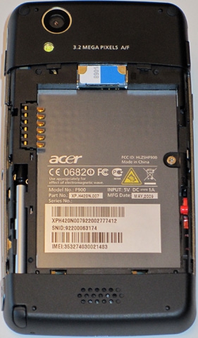
Figure 7: My, what a big battery you have! It's very thin, though, so it doesn't add a lot of weight.
Open the battery cover and you'll find, surprisingly enough, the battery. Unlike with most phones, the battery is locked in place by the red switch to its right. The SIM card is the only other item of note here.
Size and Weight

Figure 8: A comparison to a few likely competitors...
Considering its very large screen, Acer have given the F900 some svelte dimensions. It's a bit larger and heavier than the TD2, but lighter and thinner than the TP2 with its slide-out keyboard. If you're interested in the F900 but prefer the hardware keyboard, a sister unit with such a keyboard, the M900, is available.

