Wednesday, July 1, 2009
I Love It When We're Cruisin' Together - the HTC Touch Cruise Reviewed
Posted by Doug Raeburn in "Pocket PC Hardware" @ 07:00 AM
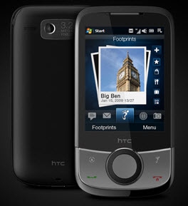
Product Category: PDA Phone
Manufacturer: HTC
Where to Buy: Expansys [Affiliate]
Price: $469.99 USD
Specifications: From the HTC site
Pros:
- Offers lots of features for a "budget conscious" phone;
- TouchFlo interface is one of the best efforts yet to make WM phones "touch friendly";
- Bundled CoPilot Navigation software adds functionality and value.
Cons:
- Battery life is merely adequate;
- Button layout on front differs from the "standard";
- Back cover feels a bit cheap.
Summary:
Everywhere you look these days, it's "iPhone this" and "iPhone that". For better or worse, the iPhone is a genuine phenomenon and has set the direction for touch enabled phones to come. Windows Mobile 6.5 and 7 will bring a variety of finger friendly touch features, but what do WM phone manufacturers do until then? If you're HTC, you put a flashy touch enabled shell on a variety of phones at a range of price levels. The Touch Cruise is one of the more affordable versions. Does HTC's strategy make it an iPhone contender? Let's take a look...
Since the iPhone has become so successful, touch enabled devices are all the rage. While WM devices have been touch enabled for years, a stylus is now so "early 2000's". These days, "touch enabled" implies using your fingers. HTC was not about to be left in the dust by the iPhone, so they've offered a line of touch enabled WM phones called, appropriately enough, the Touch series, including phones like the Touch Pro, the Touch Diamond and the Touch Cruise. They've met with a good deal of success with this line, with the Touch Diamond becoming the largest selling WM phone of all time, per recent industry reports.
While they've targeted the "premium" phone market with the Touch Pro and Touch Diamond, with VGA screens, autofocus cameras and the like, they haven't forgotten the popularly priced market. Thus we now have the second iteration of the Touch Cruise, a phone intended to provide the Touch experience as a lower price point. To keep the price down, the Cruise uses some less sophisticated components (QVGA screen, fixed focus camera) as compared to its more expensive siblings. But does the more affordable Touch Cruise really provide the Touch experience? And how does it match up against the Touch Diamond, its higher priced sibling with the most similar feature set? Let's find out.
A Closer Look
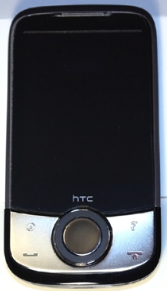
Figure 1: Not as stunning as the Touch Diamond, perhaps, but still a good looking device...
At 4.02 X 2.11 X 0.57 inches (102 X 53.5 X 14.5 mm) and 3.63 ounces (103 grams) with battery, the Cruise fits into your hand nicely. Its 2.8 in. screen is crisp and bright, but the QVGA resolution (320 x 240) marks it as a "budget" phone. Both the iPhone (480 x 320) and the Diamond (640 x 480 VGA) offer higher resolution with sharper displays.
The Cruise provides a PDA-style 5-button layout with directional control below the screen. The 4 function buttons are standard push buttons and the center of the Cruise control panel includes an action button surrounded by a scroll wheel that also serves as a directional pad. The scroll wheel is smooth and very easy to use.
The top 2 application buttons are dedicated to 2 of the Cruise's bundled applications, CoPilot Live and Footprints (both described later in the review). Since the upper left button, typically assigned the Home key, is occupied by CoPilot, the Home key is combined with the End key on the lower right. The top application buttons can't be reassigned through Settings, so you're pretty much stuck with them, although I imagine there's a registry tweak that might work around that. Above the screen are the earpiece and a notification LED that uses green and amber lights that either flash or glow steadily to indicate such things as a reminder, low battery level, etc.
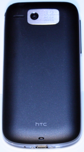
Figure 2: No faceting on the back (like the Diamond) to make it rock back and forth on a flat surface... that's a good thing!
The back of the Cruise includes the lens for the 3.2 Megapixel camera, the speaker (to the left of the lens), and a small hole that allows a strap holder to be used.
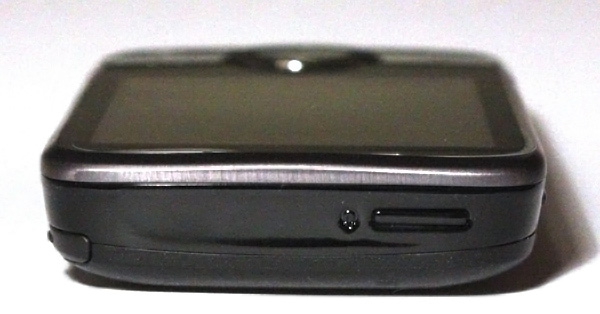
Figure 3: The view from the top is simple...
The only thing on the top of the Cruise is the power button.

Figure 4: The right side is pretty simple as well...
The right side is pretty bare, featuring only the silo for the stylus. The Cruise lacks the Diamond's unique magnetic stylus that you push in part way and the Diamond pulls it in the rest of the way automatically. The Cruise's stylus is short and rather difficult to use for a long period of time; the top presses into your fingers uncomfortably. The same can be said for the Diamond's stylus. If you're a stylus fan, I'd recommend a stylus pen for any long sessions using the stylus for either phone.
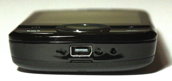
Figure 5: There's a bit more action on the bottom.
On the bottom of the Cruise, you'll find a USB jack. Don't let the odd shape concern you… it uses standard mini-USB cables. This jack is used for charging, synching and to accommodate a USB stereo headset. The microphone is also located here.

Figure 6: But the left side goes back to the simple motif.
The left side sports the volume control. This is used for system volume (for music and phone voice volume) as well as for ringer volume.
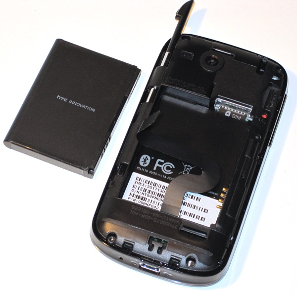
Figure 7: Take the back cover off and you'll find things nicely organized. The only real downside is that the SD card slot is under the cover, so you have to take it off to change cards.
Take the back cover off of the Cruise and this is what you'll see. There's the battery compartment, a slot for the SIM card and another slot for an SD card (it also support SDHC cards). The back cover shows signs of cost cutting; it's very light and feels quite flimsy. However, it feels fine when it's actually on the phone.

