Monday, February 16, 2009
Windows Mobile 6.5 Screen Shot Walk-Through
Posted by Jason Dunn in "Pocket PC Software" @ 07:00 AM
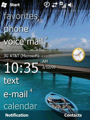
Say hello to Windows Mobile 6.5 - a handful of screen shots from the current alpha code that is. Windows Mobile 6.5 represents a significant departure from previous versions of Windows Mobile in terms of user interface, finger friendliness, and certainly in terms of browser functionality. The screen shot above is the new home screen - and you can see the Zune-like qualities it has. The home screen supports gestures, so you can swipe left or right to drill into certain options.
I'm not sure that home screen is optional, or whether third-party plug-ins will be allowed to modify it, because at first glance my thought is that I can't see my upcoming appointments, which I like having. Love it or hate it, for those that have complained that Windows Mobile has looked the same for years, you can't say that any longer! Check out all the screen shots after the break.
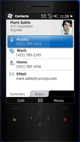
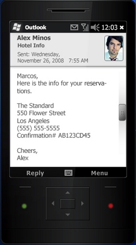
Above we have the new interface for the contacts application (left) and the email application (right). Smoother lines and a much nicer design round out the finger-friendliness of it all.

Above we have the new lock screen. It tells you quite a bit of useful information at first glance: the time, network connectivity, and your next appointment (among other things). Clicking and dragging the lock to the left or to the right will unlock the phone.
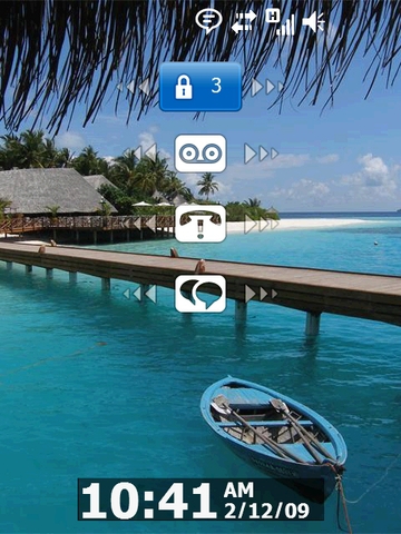
Microsoft goes further than any other phone on the market that I've seen when it comes to the lock screen: if you tap the lock icon, it brings up all the new items on the phone: voice mail, missed calls, text messages, and more. If there are items that you've missed - say a missed call - the icon will indicate it. Even better, if you sweep the icon left or right, it will unlock the phone and activate that application. In the case of voice messages, when you activate the toggle on that icon, it will dial your voice mail number. Nice!

