Wednesday, December 24, 2008
Feel In Touch: The Samsung Omnia Reviewed
Posted by Jon Westfall in "Pocket PC Hardware" @ 09:00 AM
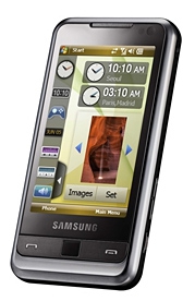
Product Category: Windows Mobile 6.1 Professional Smartphone
Manufacturer: Samsung
Where to Buy: Expansys [Affiliate]
Price: $689 USD (16 GB), $634 USD (8 GB)
Specifications: 5 MP Camera, 3.2 TFT WQVGA Touch screen (240 x 400), Bluetooth 2.0, Wi-Fi 802.11g, Quad-band GSM/GPRS/EDGE, HSDPA 7.2 Mbits, TV-out, FM Radio, Integrated GPS, microSDHC, 1440mA battery
Pros:
- Fun to use & responsive;
- Sleek design;
- Innovative value-added features (e.g. flashlight, haptic feedback).
Cons:
- Widget Bar: full of promise, low on usability;
- No multitouch ability;
- Price and availability.
Summary: I've posted news on the Samsung Omnia over the last few months and found it to be interesting enough to purchase. What I found when I opened the box got me excited to be using Windows Mobile again, something I doubted could ever happen. Read on for my experience re-discovering the OS through Samsung's vision of usability.
Getting To Know The Omnia
The Omnia measures 113 x 49 x 15.1 mm (4.45 x 1.93 x .59 in) and weighs in at 140g (4.94 oz). It feels nice and light to the touch without feeling cheap. The first thing that a Windows Mobile user will notice is the absence of a normal D-Pad. The Omnia sports a call send, call end, and action button on the front, with the action button holding a surprise. Not only does it work like the normal center button on a D-Pad, it IS the D-Pad. Moving your finger from side to side or up and down will scroll as if using a normal D-Pad. And if that doesn't float your boat, Samsung has also built in a mouse function that will let the little black action button control an on-screen mouse pointer. Functionality similar to a laptop's touch pad is provided, with fairly good accuracy while mousing around the screen. Turning the device on shows Samsung's unique homescreen, slightly customized below (I needed a time readout!).
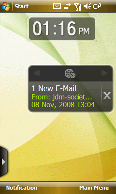
Figure 1: Samsung's widget bar, which is shown by clicking the arrow has widgets that can be dragged onto the home screen. The widgets, however, are not customizable (e.g. you cannot add new or remove existing).
For those of you not into Samsung's new look, they also provide a more normal home screen layout sans widgets. Below is the layout I've been using.
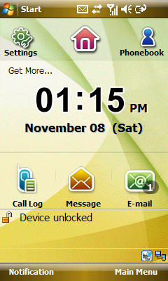
Figure 2: Alternate home screen, pressing Settings slides the icons to the right and shows Figure 3.
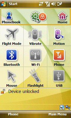
Figure 3: The settings panel, allowing you to quickly toggle vibrate, Motion (the ability to detect orientation changes and adjust screen rotation), USB mode (Activesync vs. Mass Storage), on-screen mouse, and flashlight (activating the LED flash in continuous mode).

