Sunday, November 16, 2008
MobileTechReview Examines the AT&T Fuze
Posted by Darius Wey in "Pocket PC Articles" @ 04:30 AM
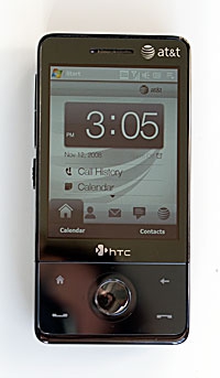
"Some of us have been waiting months for this phone to hit the US, and it's a formidable successor to the HTC Tilt. In terms of looks and size, it's a flat out winner. Though thicker than QWERTY bar phones, its relatively small width and height mean it does feel overly large. The Fuze is feature-packed and call quality is good. But AT&T's heavy-handed branding, complete with a host of non-removable demo and subscription-ware make the phone seem less clean and responsive than the Sprint version. We'd like to sit down for a serious talk with the person who designed that annoying PTT button-- even if we intended to use that service, we wouldn't want to accidentally launch it nearly every time we handle the phone. On the upside, the Fuze has a superb VGA display, the second best web browser after the iPhone's Safari, and can handle all manner of syncing and email."

There's plenty to love about the AT&T Fuze, but according to MobileTechReview, the bloatware is a letdown. If you just picked up a Fuze, how are you finding it? Would you agree with MTR's assessment?


