Tuesday, August 2, 2011
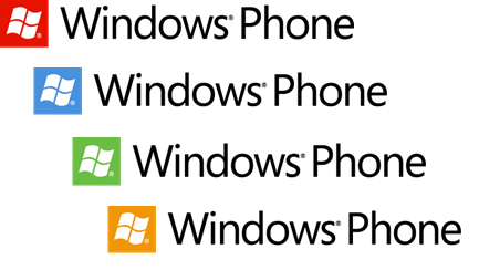
Windows Phone Logo Gets Metroized
Posted by Richard Chao in "Windows Phone News" @ 09:00 PM
"Back in May, we first saw the new flat, square (tile) look to the Windows Phone logo when we managed to get our hands on an exclusive back decal for our Focus (yeah, we're in the club)."

Squares are what should jump into your mind when you try to visualize the Metro design language used in Windows Phone 7. So why did Microsoft use a circle as part of the Windows Phone 7's logo?
Well, going forward, this will no longer be an issue as Microsoft has decided to apply the tile design to the Windows Phone logo. It's less flashy but matches better with the overall design of the phone UI. What do you think of the new logo? Should Microsoft have kept the old circle one?


