Friday, March 25, 2011
More Panoramic Control Designs: Showing Off the Best of Windows Phone
Posted by Steven McPherson in "Windows Phone Software" @ 11:00 PM
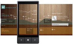
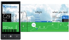
"The panoramic control was conceived to allow users explore content highlighting what is more relevant for them, and using these highlights as an entry point to further action. This model serves very well apps that are content oriented as facilitates digging into information easily but that doesn't meant it cannot be used for other purposes or even to be a destination by itself."


For the developer folks in the crowd Alfred Astrort of Microsoft is continuing to give us highlights of the unique UI elements of the Windows Phone platforms and their potential uses within applications. In his new post, we are continuing the review of the panoramic controls and specifically focusing on their use in the development of "hubs". Alfred has also given some nice samples of the panoramic control within an app while laying down some pretty logical guidelines for their use.
This UI control tends to be one of the most compelling to display lots of data that the end-user can interact with or just see their information quickly and easily.


