Wednesday, December 8, 2010
HTC HD7 - Ready to Take On the iPhone? Really!
Posted by Doug Raeburn in "HTC Windows Phones" @ 10:00 AM

Product Category: Windows Phone 7 Smartphone
Manufacturer: HTC
Where to buy: T-Mobile
Price: $199 USD with contract
Specifications: From HTC site
Pros:
- High quality look and feel;
- Large responsive capacitive touchscreen;
- Windows Phone 7 provides a unique and easy-to-use user interface;
- Wireless synching of calendar and contacts through Windows Live is included.
Cons:
- No slot for memory cards;
- Mobile Office apps (particularly Word) are short on features;
- Weak external speaker affects speakerphone performance;
- Wireless synching of calendar and contacts can be complicated to set up;
- No "cut and paste" or third-party multitasking.
Summary: With the game-changing introduction of the iPhone in 2007, Microsoft saw its position as a consistent midpack player in the smartphone market begin to decline. Attempts to update the legacy Windows Mobile (WM) OS and UI to provide a more "iPhone-like" experience met with indifference in the marketplace. The MS product planners came to the inevitable conclusion that the only way to compete with the iPhone (and the up and coming Android platform) was to introduce an all-new platform specifically designed to target the newcomers. That platform is finally here and it's called Windows Phone 7 (WP7). Long-time partner HTC has introduced the HD7, a phone with state-of-the-art specs running WP7. Does HTC's WP7-powered flagship model have what it takes to once again establish Microsoft as a player in the current marketplace, in the face of smartphone "superstars" like the iPhone 4 and the MyTouch 4G? Read on as we consider that question...
The Debut of Windows Phone 7
The moment has arrived! The veteran (Microsoft) is attempting to make a comeback in the mobile phone market, taking on the successful newcomers (Apple and Android) who have grabbed so much market share (not to mention mind share). The new platform, Windows Phone 7, is indeed a clean sheet design, a complete break from its familiar but aging Windows Mobile predecessor. But the new platform is only part of the story. With it comes new state-of-the-art hardware designs such as the HTC HD7, which is the topic of this review. Will a shiny new mobile OS combined with advanced hardware designs bring Microsoft back into the thick of the smartphone marketplace? Let’s take a look at the HD7 and find out.
The HD7 is a great showcase for the introduction of Windows Phone 7, with an elegant design and specs that rival current highend Android devices. This should come as no surprise, since HTC manufactures many of those Android devices. The spec sheet reads like a checklist for a top tier contemporary phone: 1 GHz Snapdragon Processor, 576 MB RAM, 16 GB onboard storage, 4.3 in. 480 x 800 capacitive touchscreen, 5 megapixel camera with autofocus and dual LED flash, 720p HD video recording, 802.11 b/g/n, Bluetooth 2.1, 3G, GPS and the list goes on.
There is, however, a somewhat curious mix of features provided or not provided, at least in the context of its obvious competition. Like the iPhone 4 and unlike HTC-built Android phones like the HTC Incredible, the HD7 does not provide for expandable storage. I wasn’t able to confirm whether expandable storage is not allowed by the Windows Phone 7 hardware specification or if it’s just omitted from the HD7 but, as an iPhone 4 owner, I can attest to the fact that this is a feature that even many iPhone 4 fans wished Apple hadn’t omitted. This and other missing features are a potential issue with Windows Phone 7 at this early stage of its life. To the credit of whomever made the decision, however, the HD7 provides the removable battery that the iPhone 4 lacks.
One note before I begin the main part of the review… you may notice that the screen shots are different than what you’ve seen in previous hardware reviews on this and other sites. This is because there is currently no screen capture software available that runs on Windows Phone 7. The high quality screen shots that you’ve seen so far have been taken using the PC emulator that developers use to write their software. So I’ve used a combination of published online screen shots along with some that I took of the screen with a camera. Despite my best efforts, there are limits to how well you can photograph a smartphone screen (which is why we use screen capture software when it’s available), so I apologize for the mediocre quality of those shots.
A Tour of the HD7 Hardware

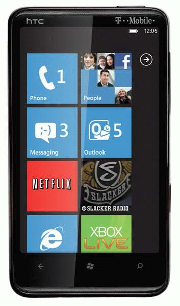
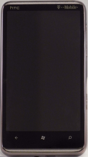
Figure 1: A few buttons and a HUGE screen.
When I first held the HD7, the elegant look and feel was immediately apparent. The front of the unit is almost all screen, with a narrow bezel on the sides and top and a slightly wider bezel on the bottom to accommodate its 3 buttons. Given that the HD7’s screen at 4.3 inches matches the largest of those currently available on a handful of devices from US carriers, it should come as no surprise that it isn’t a small phone. At 4.80 x 2.68 x 0.44 inches (122 x 68 x 11.2 mm) and 5.71 oz. (162 g), it’s larger in all dimensions and heavier than the iPhone 4 at 4.5 x 2.31 x 0.37 inches (115.2 x 58.6 x 9.3 mm) and 4.8 oz. (127 grams), but the greater size is hardly noticeable with its tapered edges all around the back. The weight difference is a bit more noticeable, but the HD7 fits nicely and feels great in your hand. And to be fair, the iPhone 4’s more svelte weight and dimensions are more the result of its smaller 3.5 in. screen than of any miraculous technology on Apple’s part.
(For the record, most of the comparisons that I make will be with the iPhone 4. That’s for 2 reasons: first, since I own an iPhone 4, I’m very familiar with it and can make informed comparisons. I’m not anywhere near as familiar with any Android models. Second, there’s 1 basic iPhone 4 design, while there are many different designs across several manufacturers for Android phones, sporting minor to major differences between models. So of the most important competitors of the HD7, I feel that comparisons to the “set in stone” iPhone 4 design are the most meaningful, as opposed to trying to pick one of the dozens of Android models as its “poster child”).
Many of the design details of the HD7 are dictated by the WP7 hardware specification, so after we’ve gotten used to them, there should be no surprises. The front of the phone is dominated by the large screen. Above the screen is a thin mesh screen for the earpiece and the notification LED is behind it, invisible until it lights up. Below the screen are the required WP7 hardware buttons: Back, Start and Search. These are capacitive touch controls rather than physical buttons. Below the buttons is another thin mesh screen that one might guess is the microphone, but it’s not… apparently this screen is just to provide a symmetrical appearance. I find the whole mesh screen approach to be an attractive design detail.
When you look at the HD7 from the side, the first thing you may notice is the smoke colored shiny metal frame that surrounds the entire phone. Just another example of the phone’s very elegant design.

Figure 2: Audio jack and charge connector are non-proprietary. How about it, Apple?
The bottom of the phone sports the 3.5 mm audio jack, the micro SD charge/sync connector and the microphone. The standard jacks are a welcome feature, since Apple insists on sticking with a proprietary connector for charging on all of its mobile products, including the iPhone 4. (Apple does provide standard audio jacks, however).

Figure 3: The hardware camera button (a WP7 requirement) is a nice touch.
The right side of the HD7 contains the volume rocker switch and the required hardware camera button. The latter is a very handy feature in that it turns on the phone and the camera even if the phone is locked. The iPhone requires that you power up the phone, unlock it if it’s locked and then find the camera icon to activate it (assuming that you haven’t included it in your docked applications, which I don’t). And the hardware button is also the shutter button, so the HD7’s camera offers a camera experience more in line with dedicated cameras.

Figure 4: It's lonely at the top... just the power button and nothing more.
The top has nothing more than the power button which, in addition to power on/off, provides control for entering and exiting sleep mode and muting the ringer during an incoming call.
The left side of the phone has no controls at all. So this review has no pictures of it at all.


